Typography Practical
Inspiration
For my practical task I looked at typography used in classic film noir which we could use for the title of our own to be shown in our piece. Many of the common themes I found were drop shadows or 3D text, such as the titles shown below.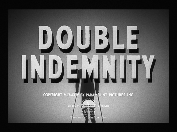

The quotation marks were also a common feature and serve to remind the audience that the film is a story. Many films also have an 'in' before as the title is shown after the names of the actors who are an important part, as many actors such as Humphrey Bogart were the stars of many film noir classics. The fonts varied widely, with some titles using blocky sans serif fonts and others with fancy display fonts.


Many titles are also slanted for added drama.
Creating my own
I decided I wanted to base my title off of the title for 'Mildred Pierce', as I liked the way it combined the sans serif and show font as they complimented each other well. For this, I used the font AR Blanca for the title and Arial for the 'in'. I thought AR Blanca was a good font to use as the letters are worn at the edges and the font is calligraphy style which would be appropriate for the era. As a group we had previously discussed using the name 'Harlem Sunset' for our piece so I have used it in this task. I used a drop shadow at 100% opacity to make it fully black and used a light grey for the text in order to increase the contrast and make it more dramatic. This is what the text looks like:

However I felt the text looked too clean and sharp to be part of a 50s film, so I duplicated the layer and applied a Gaussian blur to the new one and lowered the opacity. This gives the text almost an old fashioned glow to make it look less pristine.

I was now happy with the way the text looked, however I wanted to include a background similar to the ones seen in the inspiration images. I searched for a London cityscape from the 50s and found this image. I cropped the side bits out for use as a background.

I used a curves adjustment layer to make the background darker and increase the contrast between the background and the text and then applied the same layers I've been using previously to age the images.

I have the ageing filters saved in a group to make them accessible to use as these are currently my go-to filters.
Final Product
There are two final versions of my text as I was unsure whether I preferred the version with the cityscape background or the version where the texture and grain can be seen behind the text.


Overall, I'm pleased with the outcome of my title and in the future would like to experiment more with using plain fonts and trying 3D text like in the 'Angel Face' title. I think I prefer the first one with the city background as it's similar to other titles and uses common locations seen in film noir, and the second one looks similar to a title in a silent movie which isn't the look we're trying to get. However, I think we would need to use a lighter background as the drop shadow isn't clear enough and I'd like it to stand out more.
No comments:
Post a Comment