First of all, we decided that for our student made production company we were going to use the one I made as we felt it fit the genre and looks old like our production itself.
After research, we discovered that there weren't really any production companies specifically for film noir, so we would have to use a generic company instead. We decided to go with New Line Cinema, as we liked the look of the opening.
New Line Cinema have had a variety of different openings as can be seen in this video.
We were then able to find this version of the logo through the recommended videos. We decided to use this version as it was grainy and had a slight static background noise which we felt was very fitting for the genre as film noir is a genre of the 50s, where any footage would have been specky and grainy like this.
I then edited in both of the company introductions. I used a fade transition between each one to make it more smooth.
I'm pleased with our choice of production company introductions as I feel they add to the authenticity of our film opening. The New Line Cinema opening is generic but the old grainy effect makes it seem more era appropriate, and the opening that I made is specific to film noir so fits nicely and also the sound effect in it is dramatic and builds up to the start of the film opening.
What I really liked about this introduction was that it was really creative, each picture was simple but stood out in bold black pen.
The way the images gradually get closer into the details of the face, by getting bigger, makes it seem as if it's zooming into the person's face. This enhances the effect of the sinister smile and black tear. Giving the overall introduction a sense of eeriness, and as a consequence would be more suited to a horror genre of film.
Paralleled diegetic sound of paper flickering is used as well as the low beat non-diegetic sound at the end, appearing at the same time as the last picture of the flipbook and production title, which makes it more dramatically effective and ominous.
Serif typography conforms to the convention horror, as it's often used to represent religion or the supernatural. However, it is in the right hand corner, tucked away from the main focus image. Arguable this could be too small and isn't as prominent in the frame, however it doesn't obscure the flipbook.
As I have never used photoshop before I looked on Youtube to see how to create an animation of a lightbulb lighting up.
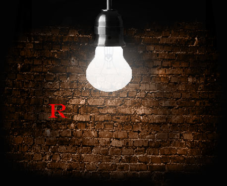
Firstly, I chose an image of a lightbulb which I would later edit to make it look like it was lit up. I used the Youtube video to see how to create this animation. I also added in my own effects to fit in with our film noir genre.
I then found a background of a brick wall to correspond to the film noir genre which is often filmed in the city or in alley ways. I used an orange filter over the brick wall in the final product to make it look darker as film noirs are often filmed in black and white.
Next I added the lightbulb to a black background and layered this over the image of the brick wall. So that eventually when the bulb was lit up and the wall behind it was also lit up.
Following the steps on the Youtube video I edited the light bulb to make it look as if it was lit up.
I then had to create an image of the bulb before it was lit up so that in the animation it would look as if the light bulb was lighting up.
Finally, I used movie maker, which I was familiar with, to put all of the images together to create the animation. As a group we had decided that we wanted to use the french word 'rouge' in our production company name which means red in english. We chose 'rouge' because the seductress in the film noir genre is often wearing red. Our final name was 'Rouge Films'. I added each of the letters underneath the light bulb and saved the image each time I added one letter. I left the first letter in red to fit in with the production company title.
I added in some effects and music ("Dances and Dames" by Kevin MacLeod (http://incompetech.com)) which was jazz, often used in the film noir genre. I thought that the letters could not be seen very clearly on the background of bricks so I faded the background into white so that the production company name could be seen more clearly.
My final video is below:
Pros:
It fits in well with the film noir genre as there is jazz music.
There is an emphasis on lighting which is also an important part of the film noir genre.
Cons:
The opening is quite long (around 11 seconds) therefore could be speeded up.
When the letters appear in front of the brick wall they are not very clear so in the future I would create a bigger contrast between the colour of the text and the background.
First I decided to choose a name for my production company. I knew I wanted to use something French as the genre film noir derives from France and even means "black film" in French. I decided to go with "Film Rouge" because in film noir red is the other prominent colour, however I felt that Film Rouge sounded too similar to Film Noir itself just with a different colour, so in the end decided to go with "Rouge Films" - Red Films.
I began by creating a logo using Photoshop. I used the font "fangsong", a font designed for Chinese letters however I felt that the English alphabet also looked fitting in it, and put the text in white so later I could use a black background. I then added some layer effects to the text:
At this stage, it looked like this:
However, I feel like this logo didn't capture enough of the film noir genre. Firstly, I made the full stop red so as to give it a black, white and red colour scheme to fit in with the genre and with the chosen name. I also found a clipart of a magnifying glass, a common symbol associated with detectives, and used it as the 'O' in the logo. The finished logo looks like this:
Company Introduction
As I'm very familiar with Photoshop, I decided to make all the frames on there and import them into a video editing program later. Although this took a while, I found it allowed me to create a decent finished product later on. I began with the background, for which I used this picture:
As I was creating a production company centred around film noir, I first made it black and white by desaturating it. I decided I wanted to use interesting lighting in my opening, so I began playing around with the lighting effects feature, which looks like this:
I then chose to use three flood lights coming down from the top of the screen. For this I needed three separate layers as I wanted the lights to turn on at different times.
Here is the final image with all three lights visible.
I then added the logo I made earlier over the top and used the tween function to create images of the logo fading in an out. I used these later when putting together my logo in Windows Movie Maker.
Windows Movie Maker
Despite having access to better programs such as Final Cut Pro and Sony Vegas, I decided to use Movie Maker just to put the frames together because it's simple to do and I'm not as used to the other programs, so this would be much quicker. I put all the pictures together and adjusted the times to either 1 second or 0.1 seconds depending on how long I wanted the image to be seen for.
I then decided to add sound effects for the lights turning on. Luckily, I quickly found the right sound I was looking for from this YouTube video.
This is the final movie maker editing timeline.
Sony Vegas
As windows movie maker is simple and does not allow layered sounds, I then used Sony Vegas Pro to add music over the top. I used the fade handles to make the music fade in and out to make the transition smoother.
Here is the sound I used:
In future, I'd like to use Sony Vegas for whole projects as it is a much more advanced program and is simple to use when you're used to it.
Final Opening
Here is my final production company title! Overall I think it turned out well however next time I'd like to use less programs to do all the little bits.
I decided on using playing cards as a motif, which is common in Film noir films as my opening sequence: 1. First of all I started by setting up by laying out scrap paper against a wall in my conservatory as I wanted the wall to be in the background to convey an industrial underground setting.
2. I next used a dark pink food colouring and tested the colour, as this would be my blood for the introduction, which I would flick onto the cards, with the paintbrush, to create a gunshot blood splatter effect.
3. When filming my first attempt, I slowly dropped the cards and was happy with the way it fell and the diegetic sound it made.
4. However when I used the blood I found that it didn't show up very well and was unsatisfied with the outcome.
5.As a result I moved in closer but I already liked the bloody effect on the cards. So I used this and flicked the food colouring onto the cards again.
6 .In VideoPadeditor I played around with the effects on the video effects tool to see different ways I could make this more appropriate for a Film Noir genre. Firstly I tried to enhance the red but the rest of the cards still wouldn't show up at all.
7. Making the whole thing darker and suturing the image more generated a Film Noir feel.
8. Blurring out the edges I made the cards seem more sinister and dark and thought this was effective for my introduction. After this I used a gunshot sound effect and it's shell falling as the splatter of blood was shown in frame, emphasising the gunshot splatters and making it more realistic and dramatic.
9. Using the text tool I added "Rouge Anecdotes Films" as the name of the company to the side of the frame so it doesn't block the cards. Though I made it fade out later on so the gunshot can be heard and seen, making that the focus of the introduction instead as this made it more dramatically effective.
Final product:
Evaluation
Improvements and developments:
I could make on this would be to remake this with a fresh pack of cardsfor full impact of the gunshot effect, rather than keeping the blood on the cards already, so I can compare which one looked better.
Also, I could have tried to use final cut to edit the clip however as I did this at home and don't have a Mac, I resorted to the next best thing.
What went well:
The filming itself was simple to do and easy to put together, and once it all came together it worked well. I believe that using cards is an appropriate motif for the film noir/ neo noir genre.Therefore, would be suitable for the filming of our opening scene.
Above is the production company introduction for Blumhouse Productions, a production company that specialises in low budget horror films such as Sinister, The Purge and Paranormal activity, which was made on just $15,000 and grossed over $193,000,000. Since 2009, they have produced over 40 films, the vast majority of which have been horror and a few comedies and dramas.
Sound
Throughout the clip a loud heartbeat and frantic breathing can be heard. The rate of the heartbeat increases rapidly throughout to signify the build up of fear and the breathing stops halfway through to emphasise the extreme terror. This is very fitting for the company's main genre of horror. The heartbeat also cuts off very suddenly at the end as the logo appears to imply death. At the end, all the sound is cut off and the only thing that can be heard is the electrical noises from the light, implying it's faulty which fits with the common setting for horror films - old houses. The company's logo also features an old house.
Many sounds build up during the clip to show a build up of fear and intensity. It begins with just a low hum and when the chair is shown a violin playing a sinister, creaky noise joins in followed by the harsh slam of the door. All of these noises are intended to create tension and to make the viewer jump. The crinkling of the paper can then be heard, and as the girl is shown this is joined by a creepy sounding female voice and a music box as these are both common horror film tropes. Several more unidentifiable sounds then join and contribute to the build up before all the sound cuts off.
Editing
The video is filmed in one whole take to give the impression of someone looking around frantically. As it gets further in, the camera movements begin to speed up and shake to increase the impression of nervousness. CGI has of course been used to create the image of the flying paper and chairs. Also, to add to the effect of faulty electronics, towards the end the camera glitches very suddenly.
Mise-en-scene
The clip is very centred around supernatural horror. The book and chair are floating in mid air and the door slams by itself which relates to the idea of ghosts and makes the viewer feel as though they're not alone, whereas the young girl provides connotations of possession as young children are commonly the victims of possession. This is because children are usually seen as innocent and seeing them in such a different settings creates fear and tension. Finally, the hanging light creates a sense of interrogation and being watched.
School Production Company - Watershed Productions
This is the production company titles for Watershed Productions, a fictional production company made by another AS media group. The red colouring in water looks like blood which creates an eerie effect, which is added to by the glitching of the text and image. The font is sans serif which means it's unlikely to be a supernatural horror film as there are no religious connotations, and the blood suggests that the production company's main focus would be on slasher horror films.
I found the way the text glitches to be particularly effective as the background behind stayed still which made it seem slower and more eerie in comparison. The glitching sets the viewer on edge as it happens at random moments, meaning the viewer doesn't know what to expect.
The colouring ('blood') drips onto the top left corner and slowly spreads out across the screen like real blood would if dropped into water. The video is then suddenly reversed and the colouring recedes back into a corner again. I thought the it looked very like real blood due to the colouring that had been applied to the video so I thought it was fitting for the horror genre. It also makes use of vague, creepy sound effects which cannot be distinguished and therefore makes it more disturbing.
The first completed draft of my production company intro:
How I made it:
I began by noting common motifs of film noir, the genre we would like our opening to be in. Swinging lights seemed like a very obvious one, that seemed simple enough for me to do. I researched how to go about it, as I have little knowledge of detailed video effects. I found this tutorial. The tutorial was designed for After Effects, but the basic principle could easily be transferred to any video editing software. My group has not yet decided our production company name, so I am using the placeholder "Rouge Films".
Making the background:
I used Paint.NET for the background, as it is free, fairly versatile, and I have used it for several years and am therefore very familiar with it. I started with a free to use brick texture I found. There was some slight color variation on the bricks, so I applied the sepiatone filter to make everything monochrome, in true film noir fashion. I then used an overlay layer to create some lighting effects, so that the wall didn't seem so bright and flat. I also cropped it to standard video dimensions (1080p). I applied a combination of the oil painting filter and a noise filter (with motion blur) to create a film grain effect.
I searched for 50s style fonts, and found a list of suggestions. Out of them, I chose one that was nice and clear and bold, but also a serif font as it is more appropriate for a gritty genre. The font is Rockwell.
The plain black text stood out too much, but I didn't want to add more textures, as I think it should remain simple. Instead, I copied the same texture as the background, increasing the brightness slightly and adding a drop shadow (using a duplicate text layer but in black and applying a blur) to make it legible.
Once I was content, I exported the text and the background as separate images to then import into my preferred video editing software, Adobe Premiere Pro CS6. I scaled everything to fit the frame and then I applied the lighting effect.
I adjusted the ambient lighting to be very dark, as this makes for a better reveal. I also changed the spotlight colour to a yellow-brown colour to seem darker and more reflective of the genre. Now came the most difficult part, creating a natural motion of a swinging light.
I couldn't find a sound effect of a light swinging, so I tried to find some suitable creaking noises. I ended up with the first second of this sound clip.
Here is a work in progress, where I have not yet added the text.
I used what I knew about animation and what I'd learnt about the motion of a pendulum in physics to determine the key frames of the motion of the light. Being able to apply this knowledge from my other subjects was quite surprising. The keyframes are timed and spaced according to the maximum and minimum of a swinging pendulum. The only sound in the clip was the creaking, and this seemed somewhat unsettling, so I added some 1950's style jazz music to imply gritty film noir rather than horror. I made the fade out for the text longer than the fade for the background to draw more attention to it.
In conclusion, I am quite happy with the result, but I think the colours of the final product are too yellow, and I would maybe change it to be less saturated, perhaps changing it to grayscale instead of sepia, which doesn't appear to work very well in this context.
I'm very happy with the lighting effect, and most of the swinging motion, but despite my efforts to animate it naturally, I had difficulty with the last half a second of it or so, as I needed it to stop swinging in a reasonable amount of time, however this made it appear somewhat stiff.
Deconstruction of a professional production company logo:
Castle Rock Entertainment is a professional production company founded in 1987 by Martin Shafer, Rob Reiner, Andrew Scheinman, Glenn Padnick and Alan Horn. The company mostly produces comedy films, usually in the romantic comedy sub-genre. This includes films such as "Chaos Theory"(2008) and "Did You Hear About the Morgans?"(2009).
The video starts completely black before a light appears. This light is, at first the only thing visible. There is bright, gentle piano music. The use of moving lights to reveal objects is a common motif in our preferred genre, film noir. With some scenery changes, such as making the light source a swinging lamp, and changing the motion of the light, it would be an effective method of revealing the name of our production company.
The intro fades in with the scene remaining very dark. This creates a silhouette effect, especially contrasted with the bright light of the sun rising behind it. The focal point, the lighthouse, is located in the middle instead of offset, creating a very striking image. A violin plays parallel with the rising sun.
The logo is revealed as a silhouette as the light shines on it, and transitions to white as the light moves away and disappears, leaving the logo behind. The logo itself is a thin serif font, with the letters C and K appearing as sort of book ends to the whole piece.
This production company intro is interesting, and I have found some techniques and effects that could be relevant to my own intro, but overall, I think its themes are too dissimilar to my own.
The genre of films it produces is sci-fi, horror
and action.
Some of the most recent films include:
Suffragette(2015), The Black Sea (2015), The Theory of Everything (2014), The Box Trolls (2014) and That Awkward Moment (2014)
Production Company Intro
The intro begins with fading in a background of several unfocused circles which are flattened lens flares.The circles are become smaller as they begin to zoom out slowly. The main colours shown are blue and orange/brown.
We then see the 'FOCUS FEATURES' fade in on top of the background in the colour yellow. As the background appears a short sound of strings is added and then this is repeated as the writing appears.
The 'O' in 'FOCUS' is blurred to echo the background. This allows an emphasis on the title as all the other letters are in 'focus'. The blurred background also allows the audience to see the logo clearly as the focused letters contrast with the background. The bright yellow adds to the visibility of the logo. The logo is in Sans Serif.
This then fades to black as the production company intro ends.