Showing posts with label Typography. Show all posts

Thursday, 25 February 2016

Deconstruction: Typography in Film Noir


Hotel Noir, released in 2012, uses this style for its titles and trailer. It contains two staple motifs of film noir, smoke and monochrome. However, the use of a sans serif block font is a fairly recent convention. It is seen in several modern film noir movies, perhaps in an attempt to appeal to action fans, as this style (block font with metallic effects) is used mostly in gritty action movies. This can be seen here and in Gangster Squad's promotional material.
However, looking at older, more traditional film noir movies, one can see that this was not always the case. In these examples, some other styles are used.
This example uses a slanted, striped font. Striped fonts were common and most likely used to resemble the neon signs of the time in which these movies were set, the stripe being the space between the neon tubes. It is an interesting effect, one that would be easy to do, but an effective minimalist representation of a neon sign. It can also be interpreted as an art deco style.
This one is interesting for its use of a delicate cursive font for one word and a blocky serif font. They are a stark contrast to each other, making the title stand out.

Saturday, 13 February 2016

Editing: Adding Titles Credits

Titles credits  

In accordance to the deconstruction I had done, I decided to use the titles that had previously been made by Xena and put them into place.


Like in my research I put the names of the actors first which I put in as soon as the opening begins.


Then after I had finished with the actor's titles I moved onto ordering the production team's titles, with the director and executive producer's names last, which adhered to my deconstruction.


After viewing all the titles in order, I noticed that each time the appeared seemed too sudden and contrasted too much with the texture of the background filter and soundtrack, which generated a smoothness to tones of the footage. 


To solve this issue I added cross dissolve transitions to the titles so it faded out and looked more like the deconstructions of film noir that I had done.       
 

The typography itself seemed quite intense than it had done when I viewed it as an isolated picture, so to sort this out I went into the lighting control and adjustments, and moved the highlights down by -11% to make it blend into the background just a little, so there wasn't such a big contrast. I then went back and did the same thing to all the other clips.


Once I had finished I went back to view the changes, which I was happy with, then I made sure that all the titles appeared before the one minute mark because I didn't want them dominated the frame through the action scenes- or scenes of tension.

Overall, I was satisfied with how the titles turned out and fit in with the conventions of film noir, and was generally integrated well.   


Monday, 8 February 2016

Practical Task - Title Creation

Creating the Title Sequence

In this blog post I create the titles that will be shown throughout our film opening. In examples I've found, such as in The Letter, the titles are large and cover the full screen over the top of the footage rather than small and in the corner so I have created titles like these. 


I used the same font, AR Blanca which I previously used in my typography, and impact as I felt the two contrasted well. I used this image for inspiration of the titles that should be used. 

As there are more titles than there are people in our group, I researched some famous names in film noir that could be used. I decided on using Humphrey Bogart and Lauren Bacall as the leading actors as they were two of the biggest names in film noir and frequently worked together. I also used Robert Siodmak, one of the leading directors of many film noirs. I assigned the people in our group roles similar to some of our contributions, for example Mindi as wardrobe because she had to find her femme fatale costume.

Here are some examples of the titles:


Currently, they don't look so effective as they're transparent images but hopefully they will look authentic once added to our production. I tried to make them quite similar to the title typography I previously made. I applied drop shadow to the text to emphasise it more using these settings:

I also used the glow effect which I have previously used. To do this I duplicated the text layers and applied a Gaussian blur to the new layer and lowered it's opacity to 50%. Here's a side by side comparison of the text with and without this effect.


I like this effect a lot because it makes the text seem much more dated and fuzzy as opposed to clean cut. This is an example of what the layers of each of the titles look like:

Overall I am pleased with the way my text looks, and hope that it will be just as effective once edited into the film.

Sunday, 13 December 2015

Practical Task- Typography

Harlem Sunset title screen typography practical

Using Paint.Net, an image editing software, I was able to create my 'Harlem sunset' typography. I wanted to take a modernist approach to the making of the title, so from film noir into a neo-noir.  

 Step one:
I got an image of a sunset which I copy and pasted as my background and selected the sunset outline, then blacked out the rest.
Step two:
Next I found a concrete wall image, and merged it with the sunset layer. This makes an industrial image, conforming to our theme of film noir, but the sunset adds the hint of red which conforms to neo-noir.

 
step three:
 On 1001 fonts generator, an online collection of various fonts.  I found the sans serif font to go over the sunset. I liked the fact that it seemed smudged or burnt out which went with the sunset image.   


Second Photo Edit
 
Step one:
I selected a concrete wall image with some stairs which I though looked mysterious, like it was going into some sort of den. 


Step two:
I added a sun light image in the corner, which makes it seem more mysterious as you can't see the outside. Using a similar process to the previous picture, I went back to 1001 font generator and found a more block lettered sans-serif font which looked smeared.    


The result:  


Evaluation :

 In the beginning the design process was slow as I was getting used to the software, but when I played around with the software a bit more it became more easy to use.
Overall I prefer the first edit that I did as it has more relevance to the title though it's not all black and white or the conventional typography of film noir, in a previous deconstruction I found that film noir in the 1950's adapted their typographies to colour.  


Wednesday, 9 December 2015

Practical Task - Typography

Typography Practical

Inspiration

For my practical task I looked at typography used in classic film noir which we could use for the title of our own to be shown in our piece. Many of the common themes I found were drop shadows or 3D text, such as the titles shown below.


The quotation marks were also a common feature and serve to remind the audience that the film is a story. Many films also have an 'in' before as the title is shown after the names of the actors who are an important part, as many actors such as Humphrey Bogart were the stars of many film noir classics. The fonts varied widely, with some titles using blocky sans serif fonts and others with fancy display fonts. 


Many titles are also slanted for added drama.

Creating my own

I decided I wanted to base my title off of the title for 'Mildred Pierce', as I liked the way it combined the sans serif and show font as they complimented each other well. For this, I used the font AR Blanca for the title and Arial for the 'in'. I thought AR Blanca was a good font to use as the letters are worn at the edges and the font is calligraphy style which would be appropriate for the era. As a group we had previously discussed using the name 'Harlem Sunset' for our piece so I have used it in this task. I used a drop shadow at 100% opacity to make it fully black and used a light grey for the text in order to increase the contrast and make it more dramatic. This is what the text looks like: 


However I felt the text looked too clean and sharp to be part of a 50s film, so I duplicated the layer and applied a Gaussian blur to the new one and lowered the opacity. This gives the text almost an old fashioned glow to make it look less pristine. 


I was now happy with the way the text looked, however I wanted to include a background similar to the ones seen in the inspiration images. I searched for a London cityscape from the 50s and found this image. I cropped the side bits out for use as a background. 


I used a curves adjustment layer to make the background darker and increase the contrast between the background and the text and then applied the same layers I've been using previously to age the images. 

I have the ageing filters saved in a group to make them accessible to use as these are currently my go-to filters.

Final Product

There are two final versions of my text as I was unsure whether I preferred the version with the cityscape background or the version where the texture and grain can be seen behind the text.


Overall, I'm pleased with the outcome of my title and in the future would like to experiment more with using plain fonts and trying 3D text like in the 'Angel Face' title. I think I prefer the first one with the city background as it's similar to other titles and uses common locations seen in film noir, and the second one looks similar to a title in a silent movie which isn't the look we're trying to get. However, I think we would need to use a lighter background as the drop shadow isn't clear enough and I'd like it to stand out more.

Deconstruction of Typography in Film Noir

The typography used in film noir is in black and white including the backdrop to match the rest of the film. The main part of the text is in white whilst the shadowing is in black. The fonts can be a mixture of serif and san serif.


Some of the text is made to look 3D.


Often the title appears on a backdrop. This backdrop is usually a texture or a picture that links with the film. Textures used could be wood, a painted surface or a brick wall. If a picture is used it is often silhouettes of objects or people and this conforms to the common conventions of film noirs using lots of shadows. The backdrop may also be an establishing shot or the text may be layered on top of the opening scene.


The text may be slanted or straight and often the title is within quotation marks. Lighting is also an important part. Most commonly spotlighting is used so the main part with the text is lit up whilst the outer edges are dark this allows for the audience to focus on the title.

Examples

"The Maltese Falcon"

  • The text is in serif
  • Parts of the text have a slight shadow which gives it a 3D look
  • The backdrop shows a statue of a falcon which links in with the title and the film
  • Harsh lighting is used so that there are a lot of sharp shadows
  • The title is in speech marks which is common for film noir's
  • The text is in the colour white which conforms to the common conventions

"The Saint Strikes Back"
  • The text has a 3D effect as well as shadows
  • The text is in white so conforms to the conventions
  • San serif is used and the text is slanted which is also commonly seen in film noir's


Evaluation
Overall, I think that when we create our own title we need to include shadows and a backdrop that will link with out opening scene such as layering the title over the establishing shot of the detective's office.

Monday, 30 November 2015

Deconstruction of Film Noir Typography


Deconstruction of Film Noir Typography

I wanted to explore the way that different film noirs have used typography, and use them as inspiration for our final editing task.
 
First of all I looked at original film noir's of 1930-59.

A classic film noir example is on Dangerous Ground: 

  • The title itself is straight to the point about the plot. "On Dangerous Ground" is a film noir slang term which means to be in a position of danger or be involved with in a potentially harmful situation. 
  • Sans Serif font is often used in action/ modern films as it doesn't have any relation to religion or supernatural elements. 
  • The dark street as a background conforms to the common conventions of film noir, as ambient urban streets are a key feature of film noir in terms of location. Also, it further conforms as there are uses of shadows and harsh lighting which is also a key component in the success of the film.   
    1944

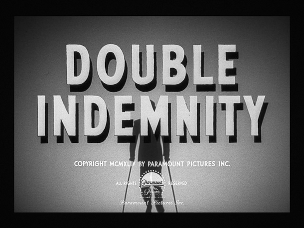
"Double Indemnity": 

  • similar to on dangerous ground it also conforms to film noir conventions as it uses  monochrome colours.

  • Sans serif is utilised to show that it's action and crime related rather than horror. 
  • The shadows of the letters is cleverly used to set the title part from the brightly lit background. 
  • Shadows are further used in the background, in the figure holding two walking sticks which compliment the title. This conveys a sense of mystery as we can't see the identity of the person, which film noir films usually aim to create. 
  • The man holding the two walking sicks perfectly compliment the title because "indemnity" means security or protection against loss or other financial burdens, so "double" means twice the support which is what the figure has.       
1946

"Crack up" begins more adventurous typography: 

  • Still keeping to the all monochrome conventions, it's still all black and white however the title itself is the centre focus. 
  • Sans serif font mimics the rock like appearance of the title, as it looks more raw and untouched. 
  • The effect of the title is parallel to the name of the film, though it doesn't give anything else about the film away.


1953


 "House of Wax"

I also chose to look at film noir last as this is more diverse than the other typographies that I have looked at.
  • When colour TV had been developed in 1951 the monochrome versions of film noir had a decline however the conventions and principles had remained. Although there has been an incorporation of colour, the remaining background image is saturated in colour and dark. What seems to be a block of buildings with one source of light in each room, creates shadows enhancing the mystery as much of the setting is concealed.
  • I had difficulty identifying the type of font for the letters of "House of Wax" and found that it was called slab-serif font. This creates the appearance of an American typewriter sort of typeface, an example of this is the font I am using now.              
  • The melted orangey appearance on the title makes it look like wax melting off the letters, which is the main focus of the typography because it's the subject of the movie and therefore appropriate for it's film. 

Monday, 16 November 2015

Practical Task: Neon Sign Typography

Using my research from my film noir typography deconstruction, I decided to make a neon sign style title. I am using the text "Rouge Films" as a placeholder to test these effects. I am using Paint.NET, a free image editor that I am familiar with through years of experience. I started by finding a striped font that resembled the tubes of a neon sign, and was free to use. I ended up using Mexcellent, a font I found on 1001fonts.com.

I used a dark background, so I could better see any glow effects I might apply to imitate a neon sign. Common colours for neon lights are red, yellow, orange, white and blue. I decided red would be most appropriate as it is a key colour in film noir movies that are not in monochrome.
I also changed the background to a brick texture, then reduced the saturation to near zero for the monochrome effect. Before I began adding various glow effects, I wanted to create the frame that the neon sign would be mounted on, which I did using the line tool on a high thickness.
 I then added a red-grey gradient to imitate how the frame would look when lit by the sign.

I also added a shadow to make it appear more realistically mounted on the wall. This was done by copying the layer, reducing brightness until it was black, blurring it, then shifting it downwards slightly.

I copied the text layer, blurred it, and then changed the layer mode to "glow". This created the glowing neon effect I wanted. I did the same thing to the frame to make it match the sign more, but it made it difficult to read, so reduced its saturation. Finally, I added a radial gradient, which I stretched to better suit the sign, to be the general light produced by the sign and its effect on the wall.

I added a light coloured stripe down each letter to resemble the tubing in the signs, and added some more glow to the frame. This is the end result.

Overall I am very happy with how it turned out, but the frame doesn't look very realistic, so I should probably try and find a photo to use for it next time. I could have also added the wires that connect to the sign. I think the glow on the sign looks very effective.