Deconstruction of Film Noir posters
I decided to analyse the posters of some old film noir films to gain more of an idea about common themes and representations around the time when the genre was popular.The Maltese Falcon
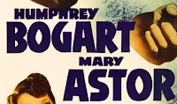
This is the official poster for 1941 film noir film The Maltese Falcon. The poster has a lot of elements, making it appear very busy and crowded which reflects action in the film. The woman, presumably the femme fatale of the film, is posing in a seductive way and making eye contact with the viewer, which is likely to draw in a male audience; the majority of the genre's target audience at the time. The femme fatale is also a key feature of film noir, which explains why she is a key part of the poster.
The central, most eye catching feature is the picture of the man holding two guns, a typical motif of film noir that has connotations of action and violence. The exclamation mark used in the tagline next to the picture also adds drama and excitement.
 The fonts used in the poster contrast greatly to the fonts used in the actual opening titles of the film. The poster is designed to be eye catching, bright and busy to draw people in, and makes use of several different display fonts and colours. Usually, in posters today, one show font will be used to add individuality with other plain and conventional fonts used to draw out the display font even further. However in this poster, three different display fonts are used.
 This makes the poster seem far more crowded than it would with a combination of show fonts and conventional ones, however in this case it is effective for the period and genre as it implies the film is heavily action packed. This is reinforced by the cartoon images which along with the fonts liken the poster to a typical action comic book.
The Enforcer
Above are two similar posters for 1951 film noir film The Enforcer, an English version (now used as a DVD case) and a presumably Spanish version. Despite using the same image, the posters are designed very differently.
The first image uses the same 'comic book' style as the The Maltese Falcon poster - it uses bright, contrasting colours and shadows with a large, flashy font - whereas the second image has gone for a more plain look, making use of an action photograph and a slim, sans serif font. The hand reaching towards the camera is ominous and creates a slight sense of fear. A gun is also shown, again being used as a common symbol representing violence.
Despite being quite different images, both are effective in their own way. The first has the same style as The Maltese Falcon, suggesting an intense and action-packed film. The second has made the writing as plain and simple as possible to force attention onto the image; this is likely to draw people's attention in as it gives little away and makes people intrigued to know more.
Sin City
Sin City is a 2005 neo-noir film, and as the name of the genre would suggest, the poster takes a modern spin on the posters of classic film noir. It's nowhere near as colourful or extravagant, and instead uses muted colours to contrast to the bright red of the title, the only real colour on the poster. Two different display fonts are used, one for the title and one for the name underneath - this is one of the main elements of film noir posters that has been incorporated. The image used looks far more like a modern action film than an old film noir film.
The opening titles of Sin City take a vaguely similar approach to those of The Maltese Falcon, as a much more plain font is used in comparison to the font used in the title on the poster. However, the font used in this film is more blocky and heavy than the one used in The Maltese Falcon.


No comments:
Post a Comment