Sunday, 13 December 2015

Practical Task- Typography

Harlem Sunset title screen typography practical

Using Paint.Net, an image editing software, I was able to create my 'Harlem sunset' typography. I wanted to take a modernist approach to the making of the title, so from film noir into a neo-noir.  

 Step one:
I got an image of a sunset which I copy and pasted as my background and selected the sunset outline, then blacked out the rest.
Step two:
Next I found a concrete wall image, and merged it with the sunset layer. This makes an industrial image, conforming to our theme of film noir, but the sunset adds the hint of red which conforms to neo-noir.

 
step three:
 On 1001 fonts generator, an online collection of various fonts.  I found the sans serif font to go over the sunset. I liked the fact that it seemed smudged or burnt out which went with the sunset image.   


Second Photo Edit
 
Step one:
I selected a concrete wall image with some stairs which I though looked mysterious, like it was going into some sort of den. 


Step two:
I added a sun light image in the corner, which makes it seem more mysterious as you can't see the outside. Using a similar process to the previous picture, I went back to 1001 font generator and found a more block lettered sans-serif font which looked smeared.    


The result:  


Evaluation :

 In the beginning the design process was slow as I was getting used to the software, but when I played around with the software a bit more it became more easy to use.
Overall I prefer the first edit that I did as it has more relevance to the title though it's not all black and white or the conventional typography of film noir, in a previous deconstruction I found that film noir in the 1950's adapted their typographies to colour.  


Saturday, 12 December 2015

Deconstruction of Lighting

The most important part of lighting in film noir’s is the shadows as the film often has a black and white filter which can enhance the shadows. The shadows can be created by using a small intense light and by emphasising the contrast between high and low key lighting. Hard lighting is the most commonly used type of lighting as it gives a sharp shadow. Whereas, soft lighting may be used to glamourise female characters.


Another common of lighting in film noir is the use of venetian blind shadows. This can create a sense of mystery as only some parts of the object or person are shown.


A foggy background can be used to create an eerie glow with silhouettes. This also creates a sense of mystery and suspense as the only two bold things we can see I the shot is the characters. However, none of their detailed features can be seen.


Shadows projected onto the walls behind are also a very common feature. This can be created by using intense lighting. The lights can be placed behind the actor to create the shadows.

Practical- Creating a 1950's Newspaper

By creating a newspaper front page we could use it as a prop in our opening scene. This could go on the pin board or we could create a newspaper and use this as the front page. 


I started with the top of the newspaper. After looking at inspiration I found a newspaper headline and adapted it a bit to form my own. The top of the article needed a border, commonly seen on newspapers, this would include the price and the newspaper volume and number which I found on previous 1950's newspapers. Beneath the headline I put a smaller headline which gave more details. 


Next I had to find the logo for my newspaper and after looking at inspiration of newspapers in my previous deconstruction I thought they looked like family shields so I found one which would work well as a logo for my newspaper. On either side of the logo I put the name of the newspaper 'Media Times' and next to this I placed small advertisements which are another common feature of 1950's newspapers.


I then created the columns and found a black and white image of an aeroplane to fit in with the headline. I choose to use three columns because most of the newspapers I deconstructed had lots of text crammed onto the front story.


As the newspaper would only be seen from far away and there would be no close up shots of it I found some random writing to place into each of the columns. This made it look like the story had lots of writing.


Next I had to edit the text I added in some gaps between the text which is often seen on newspapers and I also changed the font and size of the text to make it look like there was lots of writing.


This is what the newspaper looked like overall. I think it turned out well but in the future I would add more images.

Friday, 11 December 2015

Inspiration - Creating a 1950's Newspaper

In film noir's the detective can often be seen reading a newspaper. For inspiration I looked online at some 1950's styled newspapers. I decided on the 1950's as this was one of the eras that film noir was most popular. Our film opening is set around the 1940s/50s so this newspaper would also have to be set at a similar time to fit in with the mise- en-scene. If the newspaper was being left on the detectives desk only the front cover of the newspaper would be seen .Therefore, I have decided to create the front of the newspaper first.

Los Angeles Times


Key features:
  • One main headline and two smaller main headlines
  • Photos- black and white
  • Columns
  • Several different stories
  • Small text- black
  • Newspaper name at the top in the centre
  • Border lines at the top of the newspaper to separate the newspaper name from the articles
  • White paper
  • Small advertisement in a box on the left side of the newspaper name
  • Logo

New York Sentinel


Key features:
  • One main headline
  • Newspaper name at the top in the centre
  • Border lines at the top of the newspaper to separate the newspaper name from the articles
  • Photos- black and white
  • Columns
  • Small text- black
  • White paper
The News


Key features:
  • One main headline
  • One large photo connected to the main headline
  • The photo has a caption
  • Photo- black and white
  • Small text- black
  • Border lines at the top of the newspaper to separate the newspaper name from the articles
  • Brown paper
  • Small advertisements in boxes either side of the newspaper name

Thursday, 10 December 2015

Deconstruction of Editing in Film Noir

A contemporary example of film noir editing is Sin City. It is one of few modern movies within the film noir genre that fits the most obvious convention of being almost entirely monochrome. However, certain colours are not edited out, instead they are isolated on certain characters.

Here the red of the character's blood is isolated, but the red of the woman's lips is still edited out. This is likely because the male character is a main character.
This character's blue eyes are in colour, drawing the viewer's attention to them in particular rather than her face in general. This, combined with her expression, gives her a clear sense of vulnerability.

Key features are highlighted by isolating their colours. The use of this technique is actually very appropriate as in film noir movies and detective novels, characters are often referred to by their most notable features, such as blue eyes.

There is also the standard film noir black and white filter, where all the colours are removed. This is an obvious convention of film noir and serves several purposes, such as making the genre easily identifiable, being reminiscent of older movies of the genre, reflecting the time periods in which they are often set, and as a parallel to the themes of moral ambiguity or "moral grey" often included in these films.

Film noir movies also make use of heavy juxtaposition in editing. Cuts are not necessarily in chronological order, with flashbacks and frequent jump-cuts, making the plot maze-like and often difficult to follow.


Practical Task: Colour Isolation

In some more recent film noir movies, the use of colour isolation or colour splash effects can be seen. This is where the entire scene is in black and white minus a select colour or two. This colour is almost always red. I found several tutorials on how to do this in After Effects, but I decided to use one for Premiere as I am more familiar with this program. Tutorial here.

 Unfortunately, this effect did not work very well. If I increase the colour tolerance, it just picks up the red values in Xena's hair instead of all of the red in the skirt. Though this is unsurprising for such a simple filter. I found an alternative method to create the effect in Premiere Pro here.
 I started by applying a black and white filter, then an RGB curves filter, and then adjusting the master curve. This increases the contrast.
I then imported the video again on a new layer and applied a chroma key with the selected colour. This "removes" a specific colour. I then added an alpha adjust so that the opacity was inverted. It didn't work.
In short, this failed. I'm not sure if it was the video format or my editing, but it was completely unusable.

Wednesday, 9 December 2015

Practical Task - Typography

Typography Practical

Inspiration

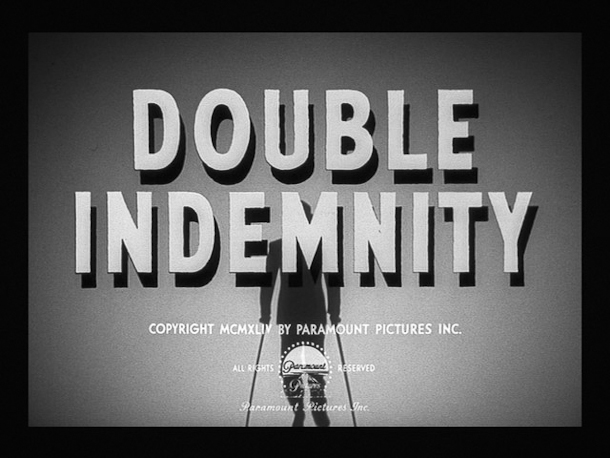
For my practical task I looked at typography used in classic film noir which we could use for the title of our own to be shown in our piece. Many of the common themes I found were drop shadows or 3D text, such as the titles shown below.


The quotation marks were also a common feature and serve to remind the audience that the film is a story. Many films also have an 'in' before as the title is shown after the names of the actors who are an important part, as many actors such as Humphrey Bogart were the stars of many film noir classics. The fonts varied widely, with some titles using blocky sans serif fonts and others with fancy display fonts. 


Many titles are also slanted for added drama.

Creating my own

I decided I wanted to base my title off of the title for 'Mildred Pierce', as I liked the way it combined the sans serif and show font as they complimented each other well. For this, I used the font AR Blanca for the title and Arial for the 'in'. I thought AR Blanca was a good font to use as the letters are worn at the edges and the font is calligraphy style which would be appropriate for the era. As a group we had previously discussed using the name 'Harlem Sunset' for our piece so I have used it in this task. I used a drop shadow at 100% opacity to make it fully black and used a light grey for the text in order to increase the contrast and make it more dramatic. This is what the text looks like: 


However I felt the text looked too clean and sharp to be part of a 50s film, so I duplicated the layer and applied a Gaussian blur to the new one and lowered the opacity. This gives the text almost an old fashioned glow to make it look less pristine. 


I was now happy with the way the text looked, however I wanted to include a background similar to the ones seen in the inspiration images. I searched for a London cityscape from the 50s and found this image. I cropped the side bits out for use as a background. 


I used a curves adjustment layer to make the background darker and increase the contrast between the background and the text and then applied the same layers I've been using previously to age the images. 

I have the ageing filters saved in a group to make them accessible to use as these are currently my go-to filters.

Final Product

There are two final versions of my text as I was unsure whether I preferred the version with the cityscape background or the version where the texture and grain can be seen behind the text.


Overall, I'm pleased with the outcome of my title and in the future would like to experiment more with using plain fonts and trying 3D text like in the 'Angel Face' title. I think I prefer the first one with the city background as it's similar to other titles and uses common locations seen in film noir, and the second one looks similar to a title in a silent movie which isn't the look we're trying to get. However, I think we would need to use a lighter background as the drop shadow isn't clear enough and I'd like it to stand out more.