Wednesday, 2 December 2015

Practical Task - Location Scouting Two

Location Scouting Part Two

In my previous location scouting post I looked at alleyways near my house which could be useful. After discussing the plot more as a group we realised we would need to use some kind of room, and decided that a garage would be suitable. So, I began by taking pictures of a garage that I would have access to at my grandmother's house. However, the garage had a brick wall behind it which may seem inappropriate for the office of a detective. It might, however, be useful for a short scene with another character we have planned. 


It would be hard to get shots without the garage door being visible, which may make this ideal for the shot of the kidnapper recording his message as an industrial, warehouse kind of setting may be suitable for this.

As I was taking these pictures, I realised that my grandmother's actual house may be suitable to film in as much of her décor is quite old fashioned and she had a good sized study which would be ideal to use as a detective's office. The study also has slitted blinds which would be interesting to try and create lighting effects with. 


As you can see, modern technology such as a laptop and printer would need to be removed prior to filming, but she has given me permission to clear the office for filming so this should be achievable. We would have to be careful not to include things like the mains socket and the modern looking radiator in any of our shots to make it more authentic of the era. 

Here are some examples of other old fashioned looking places that could be filmed. Close ups of certain objects could be used as a series of establishing shots at the beginning of the opening to set the scene of the house and suggest the time period to the audience. 


I also filmed some shots of the house and compiled them into a video in order give a clearer picture of each of the rooms. However, the camera work is quite shaky as I didn't have access to a tripod at the time. 


Overall, I think the location is ideal as much of the furniture is time period appropriate and there aren't many major modern looking features of the rooms which would be hard to get rid of. However, as I live quite far away from the rest of the group, it means we'd have to have very few filming sessions as it would be difficult to keep meeting up many times if we were to use this location. I think if filmed and edited correctly with the right props included then this setting would look very effective.

Practical task- Film noir lighting experiment


Practical task: Lighting Experiment

Firstly I started looking at tutorials from film schools on lighting in film noir, I had then taken note on the advice and ideas given and attempted some low key lighting techniques.

Lighting experiment part 1

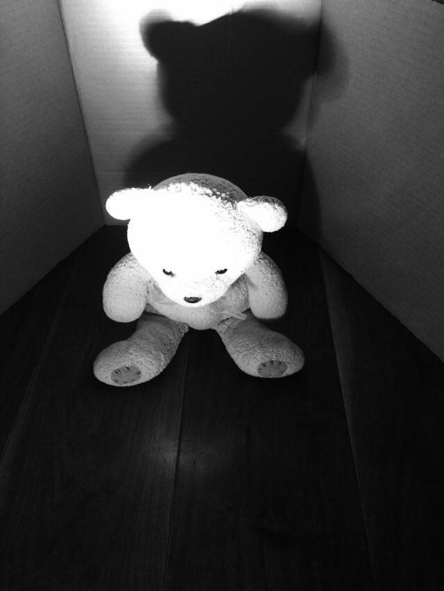
For the first part of the lighting experiment I decided to use a small lamp to light up the subject, I contained the subject so I could see the affect of lighting on a small scale. In real life this would be more effective for the face rather than the full body.   


 I used a set up of two pieces of cardboard, one behind the other to block out the light from the double doors in my dinning room.


Placing the light on the left side created a shadow in the background, but lit up the whole of the subject. In doing so you can still contrast the subject from the background. 


Using the "Noir" filter on my camera, I took pictures from different angles of the bear, then I moved the light to the other side to see the affect this had on the shadows created.   


 I found that when I moved the light closer and made the lighting became harsher, and thus blended the bear into the background through the use of shadows. By doing this, it generated more of a mystery effect as it made the bear more sinister in appearance.


I then moved the light behind the bear which resulted in the bear being covered in shadow, I thought this could be successfully used to conceal someone's identity.   


When I put the light source directly in front of the subject illuminated the bear, however blotted out the background creating a big shadow on the cardboard background. 

Lighting experiment part 2

 Next I used the big lamp as my overhead lighting and back light, I then shone the light directly above the set up/ subject. 


The effect developed from this made the bear and the background brighter, giving the effect of daytime.     

Lighting experiment part 3


The spotlight light was used next.


With the spotlight you can choose to light certain parts of the subject e.g. eyes and keep the rest of the scene in darkness. 


Once the spotlight was behind the bear it had lit up the cardboard background and right side of the bear, you could still see most of the bear due to the softer lighting, however not that well as it was dark.  


Next I tried different angles whilst using the spotlight, from a low angle the bear seems more menacing with the spotlight focused on his head. When the camera was at a high angle if still made the bear look threatening through the use of the big shadow behind it.  

Lighting experiment part 4

Lastly I cut out some strips in card and used this as a frame for my venison blinds effect.


This proved to be effective when I held it further away from the torch, as it gave off the illusion of venison blinds. 

However when I held the card close to the torch it made the gaps bigger and less effective because it doesn't look like the shadows of the venison blinds.  

Evaluation

Improvements and concerns:
A main concern that I have is that the light would have to be quite close to the subject in frame, so if it where to be a person and we're lighting up their face, they'd be exposed to the light throughout filming and cause eye strain.

Also I don't know if it would be as effective in the location, especially when we're outside as we may not have access to and plug sockets that would be nearby.

Successes:
As a whole the experiment went well, and I have learnt a lot from it and the effects created by different forms of lighting which we can incorporate into the final filming.


Monday, 30 November 2015

Deconstruction of Lighting in Film Noir

Dramatic lighting is vital in film noir. It usually features a single, harsh light, resulting in very solid black shadows. As the locations we are using are not actually appropriate for our setting, we have to light it very carefully and obscure as much of it as we can in shadows.


The first example is silhouette lighting, in which the harshest light source is on the opposite side of the subject to the camera, obscuring most of the features of the subject, but highlighting the shapes. It works especially well in film noir due to the lack of colour and high contrast, but is generally common  across all crime fiction. This example is from "Catch Me If You Can". The lighting is reflective of the context of the scene, a dark conversation laden with threats.

This technique is sometimes called an eye-light. Flags are used to block the light in certain areas so that it only lights the brow and puts the highlights in the eyes. This is used to draw attention to a female character's face and eyes. It's an interesting technique.
This shot from "Hotel Noir" features a low hanging light, resulting in the radius of the light being very small and the light being very harsh. This also creates silhouettes of the protagonist and the railings.
In this shot, also from "Hotel Noir", the light is mostly from one side of the subject, obscuring half of his face. This is reflective of his intentions to steal money. The other side of his face being brightly lit could be associated with his hopes of starting a better life with it. It is an interesting case to light half the face instead of creating a silhouette of him. Its prevalence in film noir is most likely due to how good it looks in black and white and the idea of a good and bad side to everyone.

Deconstruction of Film Noir Typography


Deconstruction of Film Noir Typography

I wanted to explore the way that different film noirs have used typography, and use them as inspiration for our final editing task.
 
First of all I looked at original film noir's of 1930-59.

A classic film noir example is on Dangerous Ground: 

  • The title itself is straight to the point about the plot. "On Dangerous Ground" is a film noir slang term which means to be in a position of danger or be involved with in a potentially harmful situation. 
  • Sans Serif font is often used in action/ modern films as it doesn't have any relation to religion or supernatural elements. 
  • The dark street as a background conforms to the common conventions of film noir, as ambient urban streets are a key feature of film noir in terms of location. Also, it further conforms as there are uses of shadows and harsh lighting which is also a key component in the success of the film.   
    1944

"Double Indemnity": 

  • similar to on dangerous ground it also conforms to film noir conventions as it uses  monochrome colours.

  • Sans serif is utilised to show that it's action and crime related rather than horror. 
  • The shadows of the letters is cleverly used to set the title part from the brightly lit background. 
  • Shadows are further used in the background, in the figure holding two walking sticks which compliment the title. This conveys a sense of mystery as we can't see the identity of the person, which film noir films usually aim to create. 
  • The man holding the two walking sicks perfectly compliment the title because "indemnity" means security or protection against loss or other financial burdens, so "double" means twice the support which is what the figure has.       
1946

"Crack up" begins more adventurous typography: 

  • Still keeping to the all monochrome conventions, it's still all black and white however the title itself is the centre focus. 
  • Sans serif font mimics the rock like appearance of the title, as it looks more raw and untouched. 
  • The effect of the title is parallel to the name of the film, though it doesn't give anything else about the film away.


1953


 "House of Wax"

I also chose to look at film noir last as this is more diverse than the other typographies that I have looked at.
  • When colour TV had been developed in 1951 the monochrome versions of film noir had a decline however the conventions and principles had remained. Although there has been an incorporation of colour, the remaining background image is saturated in colour and dark. What seems to be a block of buildings with one source of light in each room, creates shadows enhancing the mystery as much of the setting is concealed.
  • I had difficulty identifying the type of font for the letters of "House of Wax" and found that it was called slab-serif font. This creates the appearance of an American typewriter sort of typeface, an example of this is the font I am using now.              
  • The melted orangey appearance on the title makes it look like wax melting off the letters, which is the main focus of the typography because it's the subject of the movie and therefore appropriate for it's film. 

Deconstruction - Costume

Costume Deconstruction

In order to begin organising costume for our production, I have decided to look at the typical costumes of film noir characters and what they suggest.

Females

A key element of the film noir genre is the femme fatale, dangerous and seductive women who often enjoy creating danger for the protagonist. They wear heavy amounts of red and black, red symbolising passion and danger with black symbolising mystery and the unknown.


The dresses are seductive and often form fitting which means the character is able to tempt the protagonist into dangerous situations. They are sometimes shown wearing accessories such as floppy hats and long gloves, items seen as very glamorous during the 50s when the genre was at its peak. They are also often seen wearing large, gaudy items of jewellery embellished with diamonds and other jewels.


The hair is almost always tightly curled, and either long and flowing or in an elegant up-do. It's also common for femme fatales to don a veil or other hair piece if not already wearing a hat.


Bold, sultry make up is used to highlight areas of the face. As it's in black and white, the darker the colours used the more contrast there will be and therefore the more attention that is brought to the desired areas such as the eyes and the lips.

Males

An effective film noir look for men is very simple to achieve as the main features are simply an old fashioned fedora with a thick band around it paired with a trench coat. These items are used almost universally in film noir for men as, when worn in the right way, can perfectly depict either a detective or a gang member - the two most common protagonists of the genre. 


A smart shirt and tie will also be needed and will be easily accessible to us. Braces are also a common feature and could be shown if our character removes the coat at any point. 


The shirt and tie are appropriate for the character's line of work, and the fedora along with an oversized coat create mystery and to some extent conceal the character's identity, making them the perfect costume.
Overall, the male costume is far easier to achieve and for our production we will need to put a lot more effort into the femme fatale costume as it's more intricate and contains more key features.

Sunday, 29 November 2015

Deconstruction: Student Film Noir Opening - The Fatale Kiss

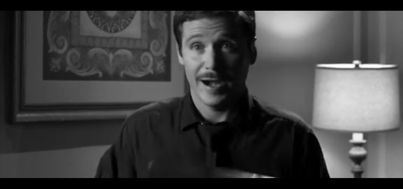
I found an AS film noir to use for inspiration, "The Fatale Kiss", it is about a runner within a gang and his affair with a gang member's daughter. It's not very high quality, but it provides some good examples of what can be achieved with almost no budget or experience. It is also not a film opening, it appears to be a short, 8 minute film.

The scene opens with close up shots of the girl with some slow piano music. Tracking shots of her feet and face are used, emphasising her supposed grace and beauty respectively. The lighting is almost entirely from one direction, creating very solid, strong shadows. The camera is placed on the opposite side to the strongest light source, which creates an interesting silhouette effect. This is something we could consider doing, as interesting shadows are a staple of the film noir genre.

 In this shot, the girl jumping up cuts to the boy landing on his feet. This is an interesting take on parallel editing that is fairly simple to recreate, aside from timing issues. The music also changes on this cut.
 The next cut is in time with the loudest drum beats of the music. This is very effecting in maintaining tension as it fits the tone of the music. In this shot, it starts with an empty frame, which the actor's hands then enter. This hints towards him just arriving, and is effective at maintaining visual interest.
In this shot, a smart phone is shown. This, along with some of the costumes, makes it very obvious that this film opening is set in modern day. I don't think this works well with the monochrome filter. It creates this strange dissonance, but I don't think that could have been easily avoided.

This is another interesting use of lighting. The silhouette effect here is very striking and I think something like this could work very well in our piece.

There are some other critique points I would mention. Firstly, due to the length of the piece, several music tracks were used. If it were edited well enough, that would not have been so jarringly obvious. The transitions between the audio tracks could definitely use some work, perhaps having longer fade outs would help. Secondly, the tracking shots were, for the most part, very shaky, with a few exceptions. This was more noticeable due to the abundance of them in this particular clip.

The strengths were definitely the lighting and variety of shots. The lighting was very harsh and effective in the indoor scenes. There were several interesting camera angles which I noted above.